Visualforce DataTable Component
Visualforce pages can be styled either by mimicking the look and feel of a standard Salesforce page or by using your own stylesheets or content types.
Many Visualforce components have a style or styleClass attribute. Defining either of these attributes in a component allows you to associate CSS code with the component. Custom CSS code enables you to change the default visual style of a component, including its width, height, color, and font.
To display a list or table with your own custom styling, use <apex:dataTable>. <apex:dataTable> generates basic HTML table output without applying any styling to it. This table is defined by iterating over a set of data, displaying information about one item of data per row. The body of the <apex:dataTable> contains one or more column components that specify what information should be displayed for each item of data.
For this post, a custom object “Bank__c” is used and the goal is to achieve the output below using custom styling for the table that will be generated.
 Given this Visualforce code:
<apex:page controller="BankDataCon" id="thePage" sidebar="false">
    <apex:sectionHeader title="Bank Profits"/>
    <h2>Quarter 1 Income</h2>
    <apex:dataTable value="{!banks}" var="bk" id="theTable" headerClass="theHead"
        rowClasses="odd,even" styleClass="tableClass">

        <apex:column  styleClass="col">
            <apex:facet name="header">Source</apex:facet>
            <apex:outputText value="{!bk.Source__c}"/>
            <apex:facet name="footer"></apex:facet>
        </apex:column>
        <apex:column  styleClass="col">
            <apex:facet name="header">Quarter 1</apex:facet>
            <apex:outputText value="{!bk.Quarter_1__c}"/>
            <apex:facet name="footer"></apex:facet>
        </apex:column>
         <apex:column styleClass="col">
            <apex:facet name="header">Month 1</apex:facet>
            <apex:outputText value="{!bk.Month_1__c}"/>
            <apex:facet name="footer"></apex:facet>
        </apex:column>
        <apex:column styleClass="col">
            <apex:facet name="header">Month 2</apex:facet>
            <apex:outputText value="{!bk.Month_2__c}"/>
            <apex:facet name="footer"></apex:facet>
        </apex:column>
       <apex:column styleClass="col">
            <apex:facet name="header">Month 3</apex:facet>
            <apex:outputText value="{!bk.Month_3__c}"/>
            <apex:facet name="footer"></apex:facet>
        </apex:column>
    </apex:dataTable>
</apex:page>
The Apex code will be added on request. The table generated without applying any styling to the page is attached here: 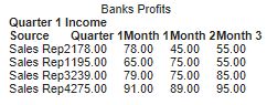 The <apex:datatable> attributes that will be used in this post are headerValue, rowClasses, and style. That is:
<apex:dataTable value="{!banks}" var="bk" id="theTable" headerClass="theHead"
       cellpadding="10px" rowClasses="odd,even" styleClass="tableClass">
For more information on the dataTable attributes check here For the column components, I assigned the same value to all the styleClass attribute, that is:
<apex:column styleClass="col">
<style>
* {
 box-sizing: border-box;
}
.tableClass {
   font-family: arial, sans-serif;
    border-collapse: collapse;
    width: 100%;
    border: 2px solid #aaa;
}
 .theHead {
  background-color: #3cb2b5;
  color:#fff;
 }
 .theHead, .col, t2 {
  border: 1px solid #bbb;
    text-align: left;
    padding: 8px;
 }
 h2 {
  font-size: 120%;
  margin-left: 10px;
  padding: 30px;
 }
 .even {
    background-color: #ddd;
    border: 2px solid #ccc;
}
.even:hover {
 border: 1px solid #222;
}
</style>